The assignment was to flesh out a word that illustrated action and come up with a non-representative design that communicated that idea. Utilizing the Principles of Design and Organization, we cut out, arranged, and assembled with cardboard stock concept designs that translated our selected word.
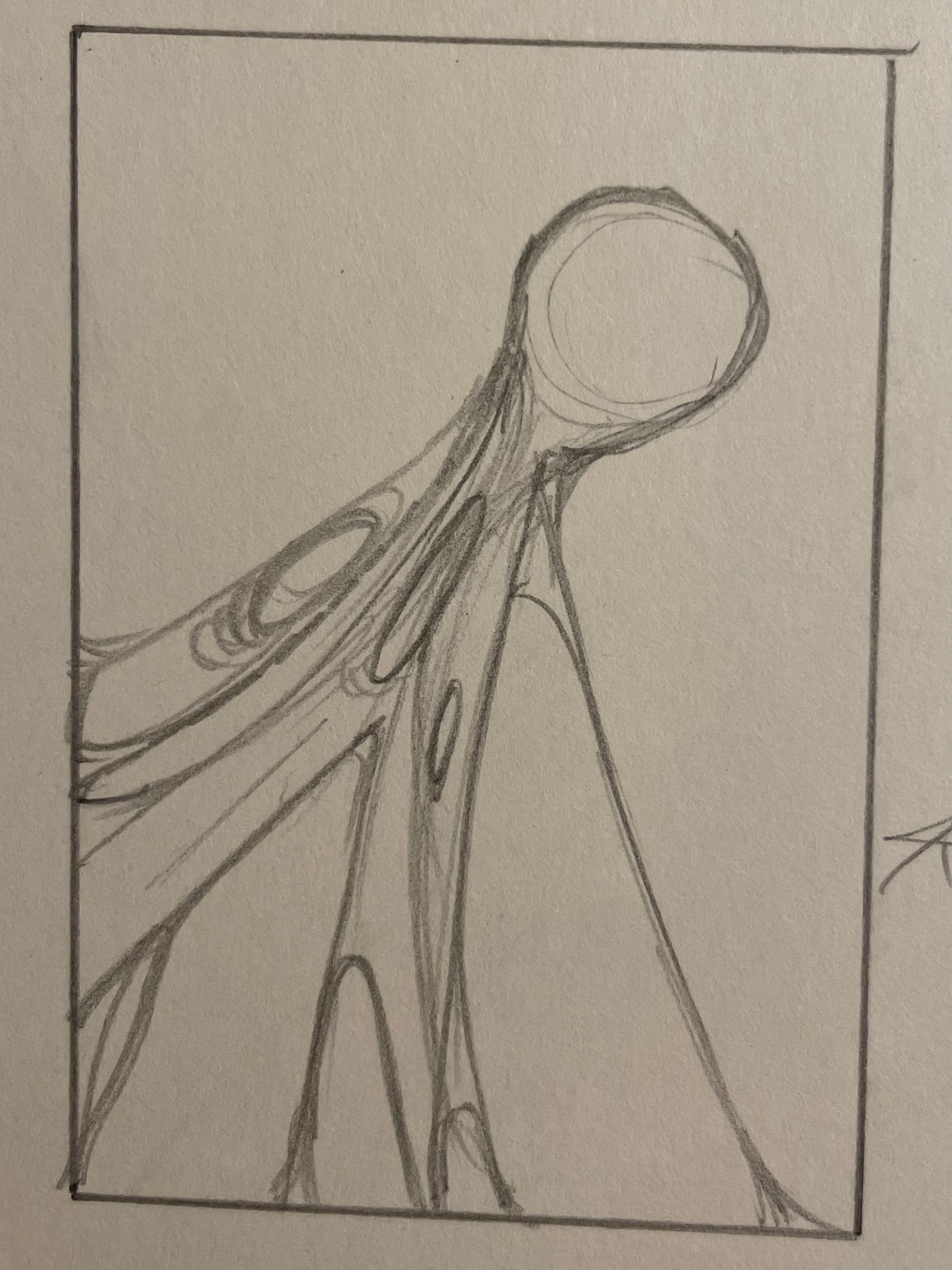
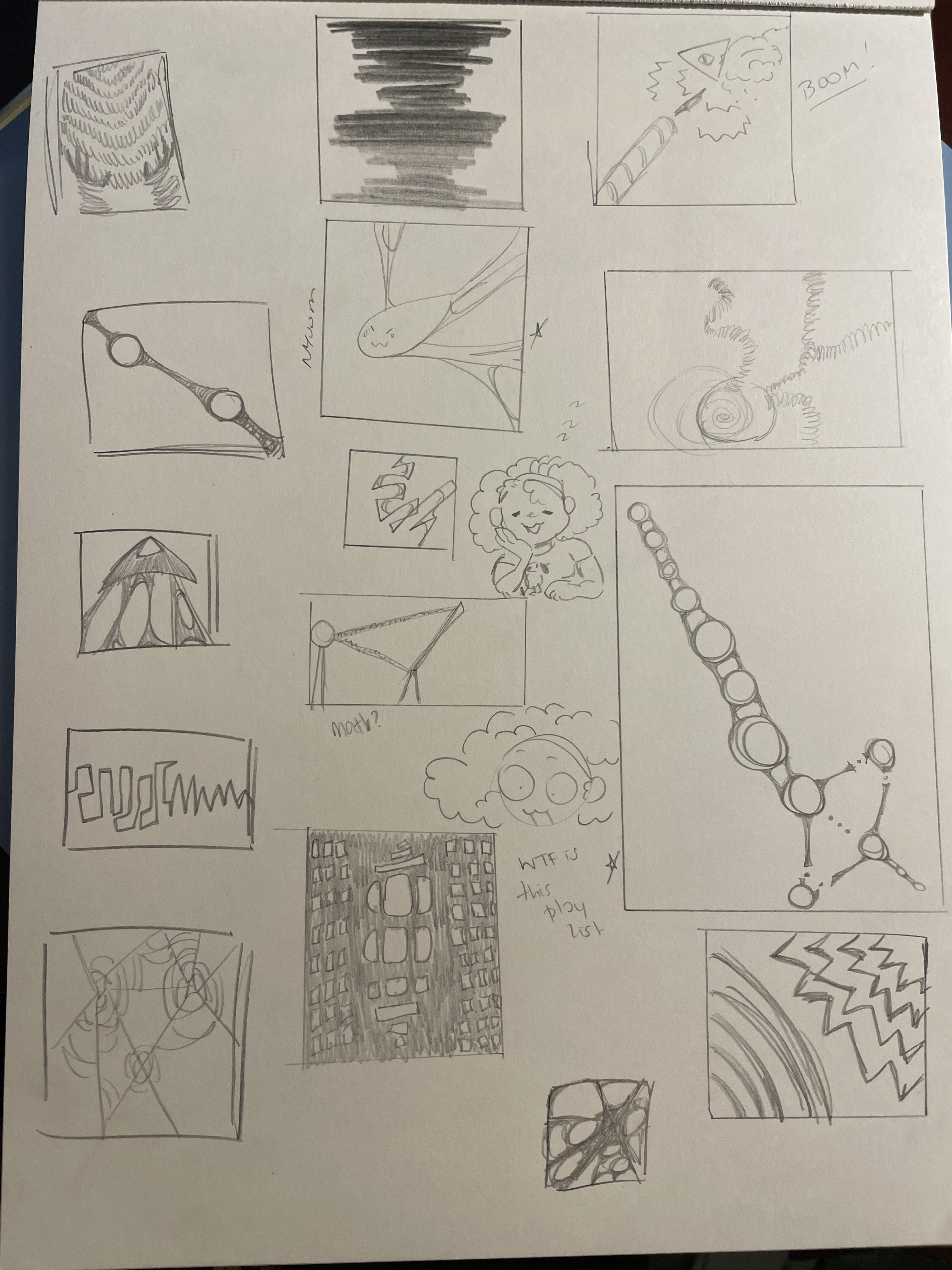
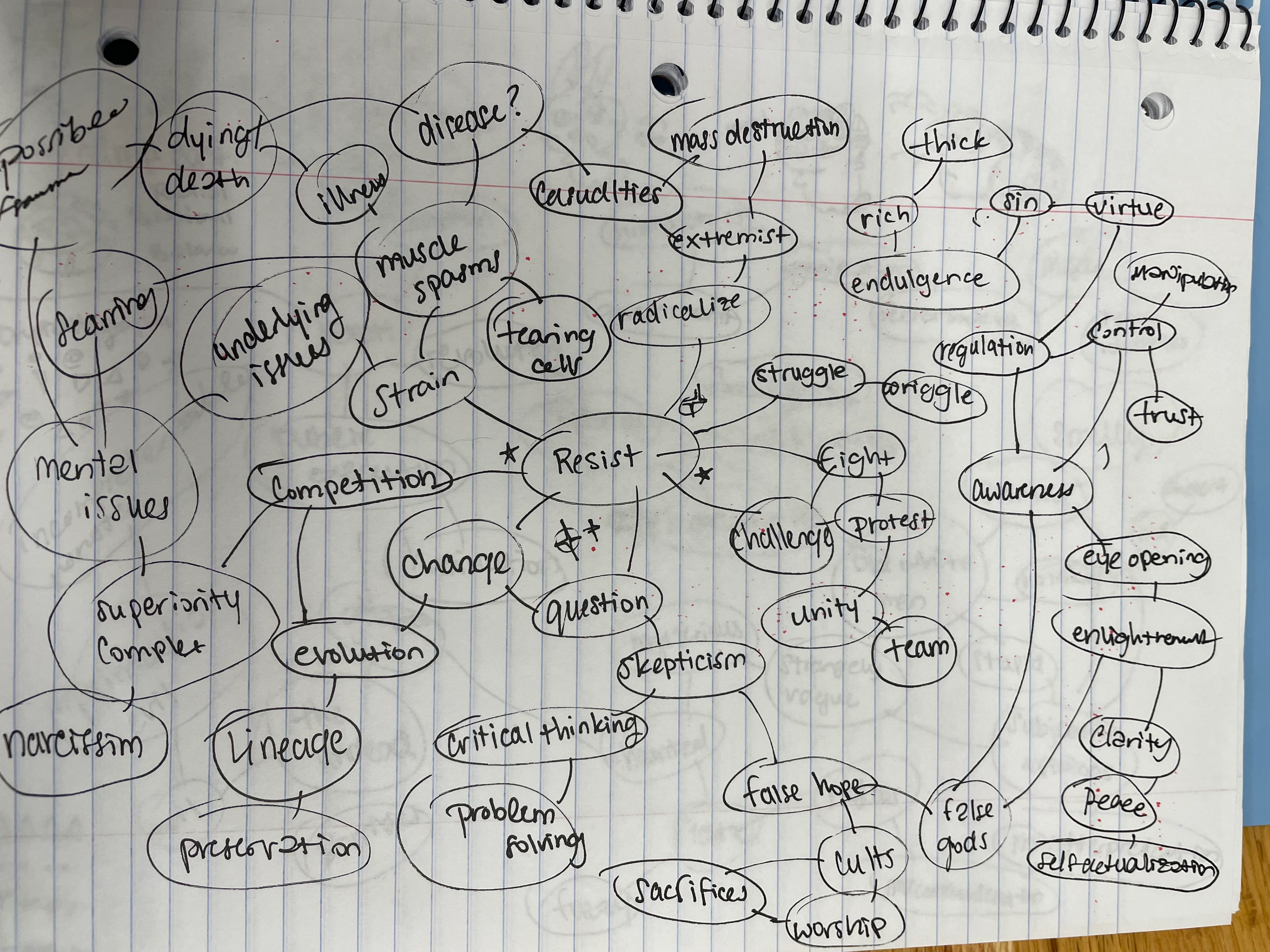
From thumbnails to mind mapping, I dove deep into recontextualizing the word "Resist" into a design that communicates this idea of muscular strain, sweat, and effort. Like the feeling of grinding your teeth, the action of potential energy builds up tension before the full release. With variety, I wanted the tears in the image to look organic or clothlike. My design was more one-sided versus the other; I wanted there to be an emotional element with literally feeling torn/impatient to see the two objects finally separate. My thumbnails mainly focused on the positioning of the bigger side barely attached to the other.
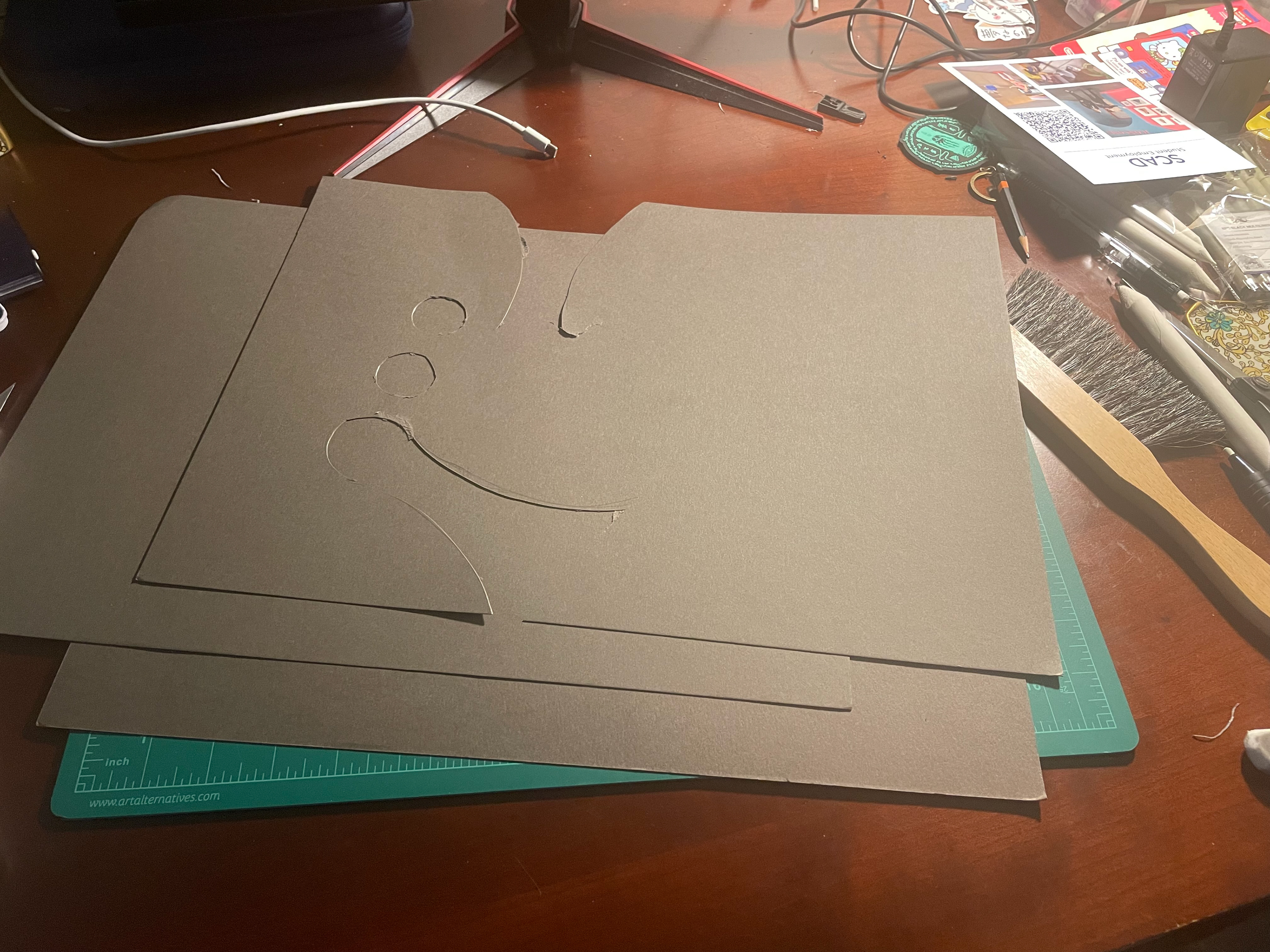
Black Cardstock paper was cut into simple shapes
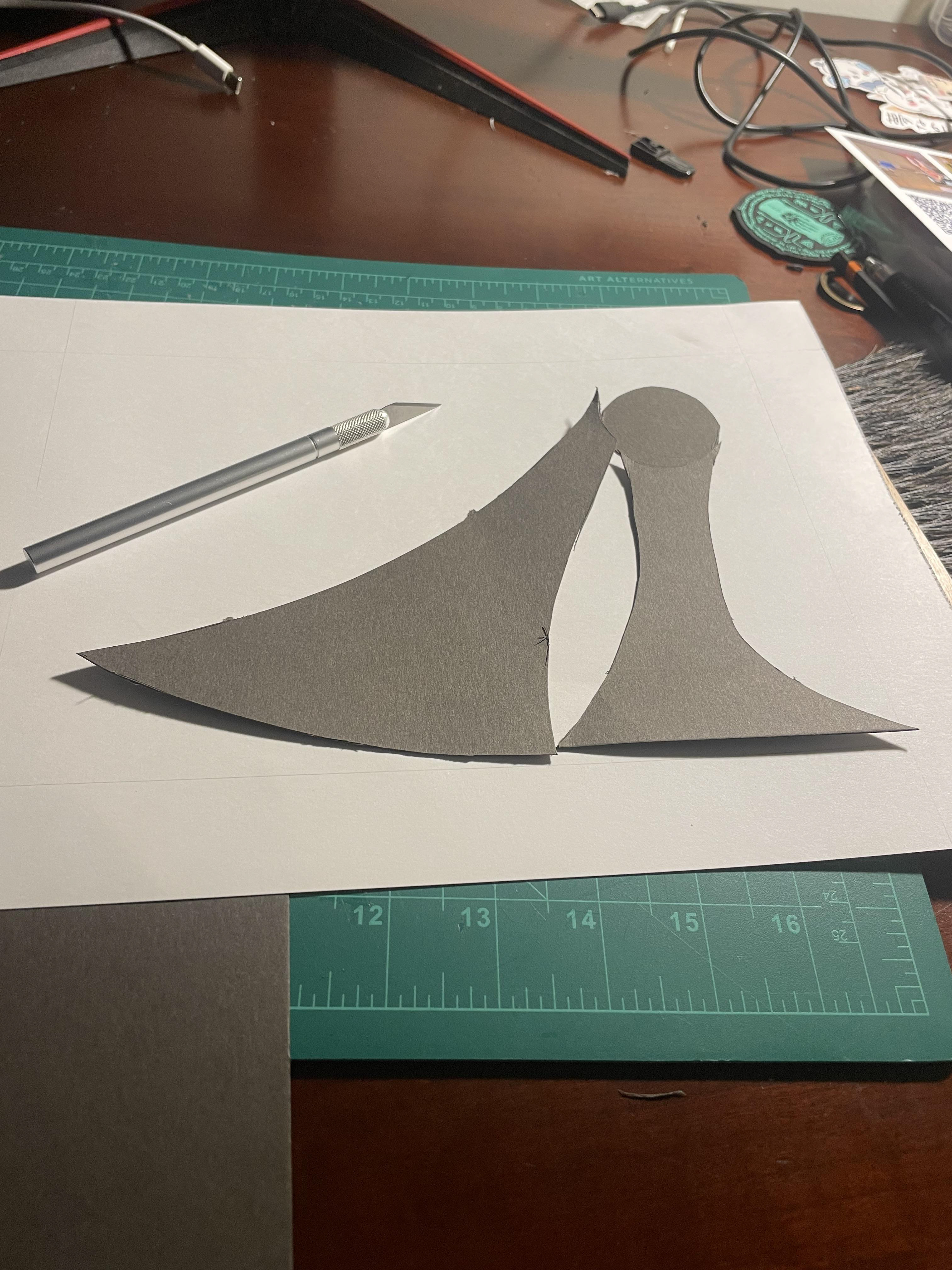
Assembled using X-ACTO knife, glue, and white poster board
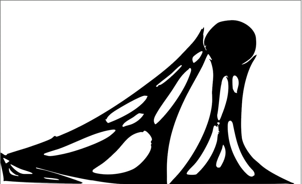
Final Design!
I vector mapped the scanned piece using Adobe Photoshop, so it shows up more clearly as a black and white rendition. This would be used as a reference in the bas-relief portion of the project.
It was my first hand at using Adobe this way to make the image pop more vibrantly. I intend to adapt more ways to use the application in future projects. Overall, I loved the concept drawing portion; I felt free to explore different ways to represent the word using professional design criteria.